OBJECTIVE
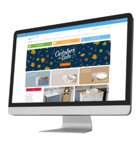
A long term client was stagnating with sales averaging £300 an order and around 2.7 daily sales. They needed more and began a new web design project to help achieve better results.


SOLUTION
Better structure of products through layered navigation, UX improvements to include upsells, cart abandonment features and more flexibility with payments. This in combination with a restructuring of content to create clearer categories and writing content with semantic coverage in mind.
OUTCOME
Launched April 2020,by May 2020 monthly revenue improved by 45%. June was up 231% and daily transactions jumped to 4. Over the bext year we saw 130% improvements in revenue and 102% more transactions.Thanks to the upsell feature average spend reached £375. The UX improvements also had tangible results, as traffic to the site only increased 51%, but it was the easy purchasing route that helped convert.


